by Fred Kuhr
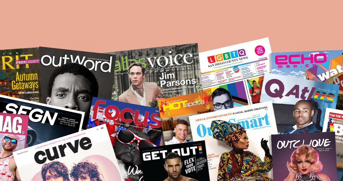
Philadelphia Gay News recently unveiled its new look, its first redesign since 2011.
The newspaper’s more streamlined and cleaner look is meant to reflect its commitment to news coverage, according to founder and publisher Mark Segal.
While its three-word motto remains on the front page, the purple block with the letters PGN is now smaller. In fact, there is less of the purple accent color than has been used in the past.
“Over the decades, PGN like other newspapers had changed it’s look to reflect the times,” said Segal. “Usually before unveiling the new format we’d inform our readers with announcements in the paper. There was a standard in the profession to do so for one month before the change. This time we decided otherwise, and did so with one announcement the week before. Our thoughts were that everything in life, including how you get your news, has become faster, and we should reflect that change as well.
Given the swift turnaround, Segal wasn’t sure how readers would react to the change. “But luckily for us, Philadelphia’s second largest LGBT event was just two weeks away, and we mounted a both at OUTfest, Philadelphia’s very large LGBT Street festival. People just came up to our booth and told us what they thought. Practically all the comments were positive and, in a show of the times, we often heard, ‘It’s about time.’”
Segal said that most commenters like the new “creative white space we incorporated” and the more “newsy” look. He appreciates that response since “our mission from day one, 44 years ago, was to be a newspaper not a magazine.”
IN THE NEWS
Volume 21
Issue 8


