Georgia Voice looks back at logo’s evolution
by Fred Kuhr
As it entered its 10th year of publishing, Atlanta-based Georgia Voice unveiled its redesigned logo on March 15. This marks the third time the log has been redesigned its the newspaper’s nine-year history.
 As part of the anniversary celebration, the newspaper took a stroll down memory lane and explained the evolution of its logo.
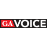
The first version of the logo actually didn’t spell out “Georgia” but merely stated “GA Voice.” This logo was created by the paper’s first designer Bo Shell and used from 2010 until the entire paper was redesigned in 2015. This logo did, however, establish the newspaper’s red, black and white cool scheme.
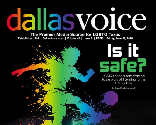
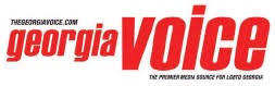 The second logo, unveiled in 2015 and designed by co-founder Chris Cash and art director Rob Boeger, used “Georgia” instead of “GA,” and added the newspaper’s tagline, “The Premier Media Source for LGBT Georgia.” The newspaper updated the tagline in 2018 by adding the “Q” to “LGBTQ.” The second logo also incorporated the newspaper’s web address.
The new version of the logo, also designed by Boeger, “evolved more into a masthead to allow for more freedom of design on the paper’s covers,” according to the newspaper. “Still retaining the red and black, this version also gives even more emphasis to the world ‘voice’ – a reflection of what the paper is all about — the writer’s voice.”
IN THE NEWS
Volume 21
Issue 1